Tag Archives: Mapping

Nieman Journalism Lab: How Ushahidi can be use by media organisations

Patrick Meier, Ushahidi’s director of crisis mapping and strategic partnerships, talks to Nieman Journalism about how the crowdsourced mapping technology can be used by media organisations in the video below.

There’s a full transcript of Meier’s comments on the Nieman site too. Ushahidi has previously been used as a crisis management tool with its initial launch used to track and monitor acts of violence and the humanitarian situation during post-election violence in Kenya.

Mapping stories and historical images on Google Street View

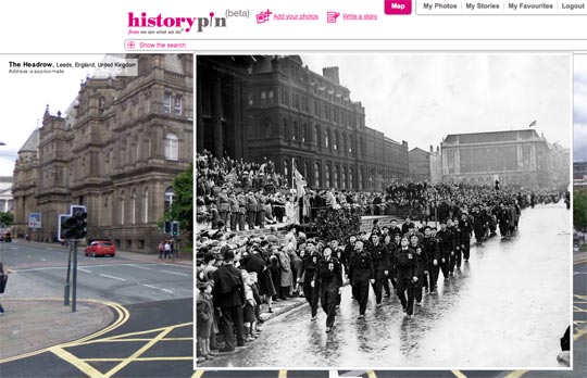
Historypin, a site that overlays historical images and related stories on Google Street View, describes itself as “like a digital time machine”:

It uses Google Maps and Street View technology and hopes to become the largest user-generated archive of the world’s historical images and stories.

Historypin asks the public to dig out, upload and pin their own old photos, as well as the stories behind them, onto the Historypin map. Uniquely, Historypin lets you layer old images onto modern Street View scenes, giving a series of peaks into the past.

It has been developed by We Are What We Do, the “social movement” and campaign that was behind the book ‘Teach your Granny to Text and Other Ways to Change the World’, in partnership with Google.

If the technology behind it were opened up, this would be a fascinating way to publishing ‘nostalgia’ pictures from local newspapers, news archives or map historic stories.

(via Mapperz)

NYTimes.com: How Ushahidi is ‘transforming the notion of bearing witness’

How Ushahidi, the mapping technology developed to help bloggers and citizen journalists share information about political violence in Kenya, is being used by news organisations and governments:

With every new application, Ushahidi is quietly transforming the notion of bearing witness in tragedy. For a very long time, this was done first by journalists in real time, next by victim/writers like Anne Frank and, finally, by historians. But in this instantaneous age, this kind of testimony confronts a more immediate kind: one of aggregate, average, good-enough truths.

Full story at this link…

Bing’s Local Lens app – potential for local news journalists?

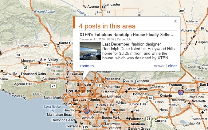
Via Lost Remote, a demonstration of a new application from Bing (Microsoft’s search property). Local Lens is a ‘neighbourhood blog app’ and can plot hundreds of blogs within a specific area on a map. The most recent posts will also be displayed and tweets can be overlayed on the map too.

The app is currently in beta and so only covers a group of US cities at the moment. The Los Angeles map is at this link and shown below:

Map from Bing's Local Lens application

But there’s potential here for tracking how local news and issues break and spread on blogs, as well as creating a visualisation of local social media reaction to an event or report.


ITN maps news items with Google mash-up

British news company ITN has started to develop Google Maps to its advantage: a new mashed-up map of its news stories uses Google Gears Geolocation API to determine the user’s location and provide them with geographically relevant news.

The site provides a map with pinpoint flags highlighting the location that a particular news item is related to. All the user has to do is click on the individual flag and read on for the full story.

The reader can change the destination to view worldwide stories, while also being able to access archive stories stretching back to the previous month.

Website mibly.com has also used Google Maps, on this instance, working in conjunction with BBC iPlayer, tagging where a certain programme was located, allowing UK residents to view the selected show by clicking on a flag.

Mapping: BBC reports live event with map tools; WaPo plots Travis Fox

Mapperz blog is claiming a BBC first, as the corporation used a series of mapping tools to cover today’s parade in London of Britain’s Beijing Olympics team.

The interactive map featured Twitter updates from BBC sport journalists Tom Fordyce and Ollie Williams and was capable of showing photos submitted by spectators (though it appears only one has been uploaded at time of writing).

It links to a Flickr group of images from the parade, live text updates on the BBC website and a full news and video report on the event.

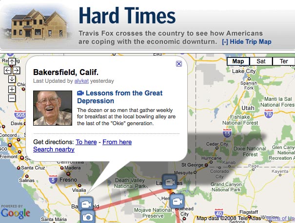
Meanwhile, the Washington Post is plotting the progress of Travis Fox, as the video producer makes a journey across the states reporting on how the economic downturn is affecting citizens.

Fox’s route is shown with markers indicating video posts and photos, which are also included in his blog reports below the map.

Geotagged journalism: behind Trinity Mirror’s news maps

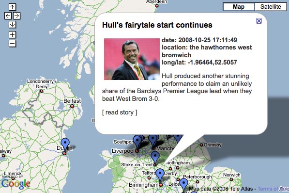
At last week’s Digital Editors’ Network event in Preston, Trinity Mirror’s new geotagged news maps were a popular topic of conversation.

Launched on the Liverpool Echo and Liverpool Daily Post (LDP) websites, the maps let readers search for news by postcode.

But what information are journalists required to input to make the maps work? and how does this affect their newsgathering?

Alison Gow, deputy editor of the LDP, explained the system to Journalism.co.uk:

“At the moment, every time our reporters create a news story they fill in certain fields which dictate where a story is placed online (e.g. story type, keyword tags, author).

“For stories to appear on the map the reporter simply ensures the new ‘postcode’ field is also completed; they do this by chosing from a vast selection of regional postcodes which are already included in a dropdown menu.”

For stories that could be tagged with multiple postcodes, the primary site of the news, e.g. the accident site in a road crash, is currently being used, though multiple location tagging is being looked into.

“We don’t use them for everything; there would be no point in geotagging Liverpool town hall for every council story, for example. But for location-specific articles they work really well.

“As it grows the map offers greater potential for ‘news from your street’ for readers, and it makes the Post and Echo sites more sticky – people can see markers for stories in their area and this should encourage them to click through and read more,” said Gow.

To develop the project further, the same map format is being looked at for other editorial content, such as business articles, she added.

Any more questions about the journalists involvement with these maps? Leave a comment and hopefully we can get a response.
Yorkshire Post maps falling petrol prices

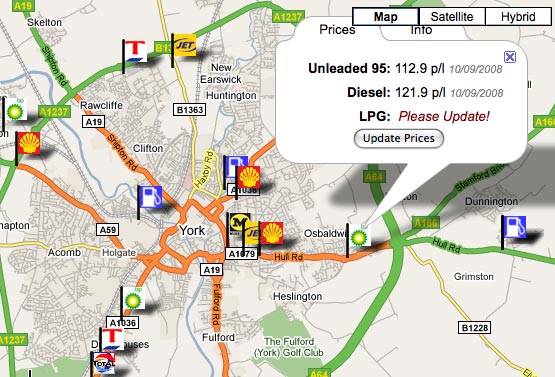
The Yorkshire Post is using an interactive map of local petrol stations’ fuel prices to help its readers in this time of credit crunchiness.

Built using data from whatgas.com, the map flags up petrol stations in the paper’s readership area and allows users to update the current prices of unleaded, diesel and LPG fuel.

Even better the feature is tied into a news article reporting on fuel prices in the region – nicely done.

The Guardian publishes first ‘geolocated’ article

The Guardian has published its first article including geolocation data and is using geographic tagging to track reporters covering the US presidential race. Every time a reporter posts a blog their location will be highlighted on a Google map.

Geotagged content has been around for a while now, but is starting to take effect in the UK media: last week, the Liverpool Echo, published a hyperlocal news map.

On Guardian.co.uk’s Inside Blog, Paul Carvill describes the geolocating process: reporters add their latitude and longitude to their article or blog post, and their location will appear in the RSS feed, which in turn can be fed into a Google map using a java script.

Online users can type in their postcode to find out what is being reported in their area, or alternatively click on an area of the map to source information from another location.

Evening Leader plots UFO sightings with Dipity

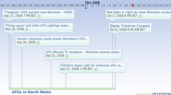
Nice use of timeline builder Dipity by the Evening Leader: the paper has plotted videos and text reports of UFO sitings in the area onto a timeline, turned it into a widget and embedded it on its website.

What’s extra nice is that the Dipity widget lets readers look at the info as a timeline, map, flipbook or list. Using the third-party service helps the newspaper get extra mileage out of what are no doubt already popular online stories.

The feature has also been made ‘public’ through dipity’s site to help drive traffic back to the Evening Leader.

The tool has previously been used by the Manchester Evening News for its coverage of a proposed congestion charge for the city; and the Liverpool Daily Post to create a 24-hour snapshot of Liverpool as this year’s European Capital of Culture.