Tag Archives: scraperwiki

UCLan project awarded £64,000 from Google to support ‘news entrepreneurs’

The University of Central Lancashire’s Journalist Leaders Programme has secured €75,000 (£64,000) of Google funding to support “news entrepreneurs” after being named as one of three winners of the International Press Institute’s News Innovation Contest.

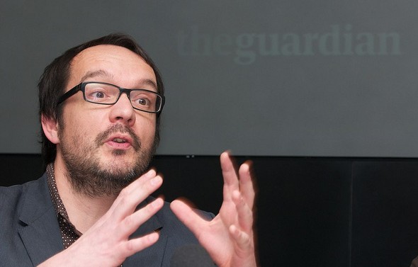
The programme, founded by researcher, academic and consultant on newsroom and digital business innovation François Nel (pictured), will develop a project called Media and Digital Enterprise (MADE), to offer an “innovative training, mentoring and research programme”.

The funding awarded by IPI will be spent by the UCLan programme on working “to create sustainable news enterprises – whether for social or commercial purposes – by helping innovators”.

Nel told Journalism.co.uk MADE will “support the entire news ecosystem as we need innovation across the sector”.

He is now looking for people with entrepreneurial ideas who are interested in news innovation.

The other two winners of the contest are Internews Europe, a European non-profit organisation created in 1995 to help developing countries establish and strengthen independent media organisations to support freedom of expression and freedom of access to information, alongside the World Wide Web Foundation, a Swiss public charity founded by Sir Tim Berners-Lee, the inventor of the world wide web.

In February Google announced it was awarding $2.7 million to the Vienna-based IPI for its contest.

There were round 300 applicants, reduced first to 74 and then to 26 before the three winners were selected by a panel of seven judges, including journalism professor and commentator Jeff Jarvis.

The winners of the total fund of $600,000 were announced yesterday; Nel heard this morning how much the MADE project is being allocated, telling Journalism.co.uk “it’s fantastic to have support for news innovations”.

Nel and others working on the Leaders Programme have been working with news organisations, including Johnston Press, Trinity Mirror and the Guardian Media Group, looking at digital processes and innovative business models.

MADE allows us to pull those strands together and work with directly with news entrepreneurs. And we’re really excited about the possibility of putting this to the test.

Nel explained that MADE will “deliver good skills for a whole range of news start-ups” and he is now “looking to work with individuals, groups and companies, who are interested in news innovation” to get involved.

The project will help develop new skills and test the business plans, offering bespoke support to those with entrepreneurial ideas.

We’re looking to support five good people and good ideas for at least three months so that we can give those ideas legs.

The project includes various partners that were part of the bid, including one to build content and one to build communities.

Developers at ScraperWiki will be working with the project to develop innovations in data journalism and build content. Another partner is Sarah Hartley who is now working on the Guardian’s social, local, mobile project n0tice, with this area of the project focusing on building communities.

MADE will also involve Nel’s colleagues at Northern Lights, an award-winning business incubation space at UCLan.

The project also has an international element, involving groups in Turkey, drawing on Nel’s connections in the country.

Nel explained why the funding and ongoing support from IPU is vital.

In the digital news media space the cyber world is littered with start ups. The corpses of news start ups are every here. What we really need to do is help news entrepreneurs stay up and that’s what we are trying to do here.

openDemocracy: What does the term ‘hack’ now mean for journalists?

Writing on openDemocracy, Nicola Hughes, who is also known as DataMinerUK, has questioned what the use of the term ‘hack’ and its related synonyms mean for journalists following the News of the World phone-hacking scandal.

Hughes explains how journalists scrape data.

The people who are part of this community (I flatter myself to be included) are ‘hackers’ by the best definition of the word. The web allows anyone to publish their code online so these people are citizen hackers. They are the creators of such open civic websites as Schooloscope, Openly Local, Open Corporates, Who’s Lobbying, They Work For You, Fix My Street, Where Does My Money Go? and What Do They Know? This is information in the public interest. This is a new subset of journalism. This is the web enabling civic engagement with public information. This is hacking. But, unlike other fields of citizen journalism, it requires a very particular set of skills.

Hughes goes on to explain how journalists “need to get to grips with data to get the public their answers” and ends with a plea saying the News of the World affair should not define ‘hacking’.

In the Shakespearean sense of “That which we call a rose by any other word would smell as sweet”, we should define journalism not by a word but by what it smells like. Something stank about the initial inquiry into the News of the World. Nick Davies smelled it and followed his nose. And that’s the definition of journalism.

The full post is at this link

Data Miner: Liberating Cabinet Office spending data

The excellent Nicola Hughes, author of the Data Miner UK blog, has a very practical post up about how she scraped and cleaned up some very messy Cabinet Office spending data.

Firstly, I scraped this page to pull out all the CSV files and put all the data in the ScraperWiki datastore. The scraper can be found here.

It has over 1,200 lines of code but don’t worry, I did very little of the work myself! Spending data is very messy with trailing spaces, inconsistent capitals and various phenotypes. So I scraped the raw data which you can find in the “swdata” tab. I downloaded this and plugged it into Google Refine.

And so on. Hughes has held off on describing “something interesting” that she has already found, focusing instead on the technical aspects of the process, but she has published her results for others to dig into.

Before I can advocate using, developing and refining the tools needed for data journalism I need journalists (and anyone interested) to actually look at data. So before I say anything of what I’ve found, here are my materials plus the process I used to get them. Just let me know what you find and please publish it!

See the full post on Data Miner UK at this link.

Nicola will be speaking at Journalism.co.uk’s news:rewired conference next week, where data journalism experts will cover sourcing, scraping and cleaning data along with developing it into a story.

#iweu: The web data revolution – a new future for journalism?

David McCandless, excited about data

Rounding off Internet Week Europe on Friday afternoon, the Guardian put on a panel discussion in its Scott Room on journalism and data: ‘The web data revolution – a new future for journalism’.

Taking part were Simon Rogers, David McCandless, Heather Brooke, Simon Jeffery and Richard Pope, with Dr Aleks Krotoski moderating.

McCandless, a leading designer and author of data visuals book Information is Beautiful, made three concise, important points about data visualisations:

  • They are relatively easy to process;
  • They can have a high and fast cognitive impact;
  • They often circulate widely online.

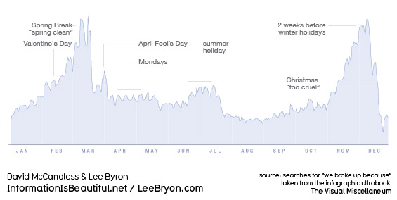
Large, unwieldy datasets share none of those traits, they are extremely difficult and slow to process and pretty unlikely to go viral. So, as McCandless’ various graphics showed – from a light-hearted graph charting when couples are most likely to break up to a powerful demonstration of the extent to which the US military budget dwarfs health and aid spending – visualisations are an excellent way to make information accessible and understandable. Not a new way, as the Guardian’s data blog editor Simon Rogers demonstrated with a graphically-assisted report by Florence Nightingale, but one that is proving more and more popular as a means to tell a story.

David McCandless: Peak break-up times, according to Facebook status updates

But, as one audience member pointed out, large datasets are vulnerable to very selective interpretation. As McCandless’ own analysis showed, there are several different ways to measure and compare the world’s armies, with dramatically different results. So, Aleks Krotoski asked the panel, how can we guard against confusion, or our own prejudices interfering, or, worse, wilful misrepresentation of the facts?

McCandless’ solution is three-pronged: firstly, he publishes drafts and works-in-progress; secondly, he keeps himself accountable by test-driving his latest visualisations on a 25-strong group he created from his strongest online critics; third, and most important, he publishes all the raw data behind his work using Google docs.

Access to raw data was the driving force behind Heather Brooke’s first foray into FOI requests and data, she told the Scott Room audience. Distressed at the time it took her local police force to respond to 999 calls, she began examining the stats in order to build up a better picture of response times. She said the discrepancy between the facts and the police claims emphasised the importance of access to government data.

Prior to the Afghanistan and Iraq war logs release that catapulted WikiLeaks into the headlines – and undoubtedly saw the Guardian data team come on in leaps and bounds – founder Julian Assange called for the publishing of all raw data alongside stories to be standard journalistic practice.

You can’t publish a paper on physics without the full experimental data and results, that should be the standard in journalism. You can’t do it in newspapers because there isn’t enough space, but now with the internet there is.

As Simon Rogers pointed out, the journalistic process can no longer afford to be about simply “chucking it out there” to “a grateful public”. There will inevitably be people out there able to bring greater expertise to bear on a particular dataset than you.

But, opening up access to vast swathes of data is one thing, and knowing how to interpret that data is another. In all likelihood, simple, accessible interfaces for organising and analysing data will become more and more commonplace. For the release of the 400,000-document Iraq war logs, OWNI.fr worked with the Bureau of Investigative Journalism to create a program to help people analyse the extraordinary amount of data available.

Simply knowing where to look and what to trust is perhaps the first problem for amateurs. Looking forward, Brooke suggested aggregating some data about data. For example, a resource that could tell people where to look for certain information, what data is relevant and up to date, how to interpret the numbers properly.

So does data – ‘the new oil’ – signal a “revolution” or a “new future” for journalism? I am inclined to agree with Brooke’s remark that data will become simply another tool in the journalists armoury, rather than reshape things entirely. As she said, nobody is talking about ‘telephone-assisted reporting’, completely new once upon a time, it’s just called reporting. Soon enough, the ‘computer-assisted reporting’ course she teaches now at City University will just be ‘reporting’ too.

See also:

Guardian information architect Martin Belam has a post up about the event on his blog, currybetdotnet

Digital journalist Sarah Booker liveblogged presentations by Heather Brooke, David McCandless and Simon Rogers.

RBI to host hacks/hackers day in November

Reed Business Information (RBI) is hosting an event for journalists and programmers interested in working together on data visualisation. The one-day “hack day”, which will take place on 29 November, will be run with the help of data scraping project ScraperWiki.

Speaking on the ScraperWiki blog, Karl Schneider, editorial development director at RBI, explains the thinking behind the event:

Data journalism is an important area of development for our editorial teams in RBI

It’s a hot topic for all journalists, but it’s particularly relevant in the B2B sector. B2B journalism is focused on delivering information that it’s audience can act on, supporting important business decisions.

Often a well-thought-out visualisation of data can be the most effective way of delivering critical information and helping users to understand key trends.

We’re already having some successes with this kind of journalism, and we think we can do a lot more. So building up the skills of our editorial teams in this area is very important.

You can register for the event at this link.

Hacks and Hackers look at health, education and leisure

Online journalism expert Paul Bradshaw gives a detailed post on his experiences of a recent Hacks and Hackers day in Birmingham organised by Scraperwiki, experiences which he claims will “challenge the way you approach information as a journalist”.

Talking through the days events, Bradshaw observes how journalists had to adapt their traditional skills for finding stories.

Developers and journalists are continually asking each other for direction as the project develops: while the developers are shaping data into a format suitable for interpretation, the journalist might be gathering related data to layer on top of it or information that would illuminate or contextualise it.

This made for a lot of hard journalistic work – finding datasets, understanding them, and thinking of the stories within them, particularly with regard to how they connected with other sets of data and how they might be useful for users to interrogate themselves.

It struck me as a different skill to that normally practised by journalists – we were looking not for stories but for ‘nodes’: links between information such as local authority or area codes, school identifiers, and so on. Finding a story in data is relatively easy when compared to a project like this, and it did remind me more of the investigative process than the way a traditional newsroom works.

His team’s work led to the creation of a map pinpointing all 8,000 GP surgeries around the UK, which they then layered with additional data enabling them to view issues on a geographical measure.

See his full post here…

ScraperWiki blog: Hacks and Hackers hack day report

As we reported earlier this week, journalists and programmers got together last Friday in London to produce some fantastically inspirational projects.

ScraperWiki (behind a new data tool soon to launch in beta) has now published its report of the day, explaining each of the projects. With a little more work, these projects could make excellent news stories.

Here are two of the ideas, for starters:

Conservative Safe Seats (the project that won overall; see video for presentation)

Developer Edmund van der Burg, freelance journalist Anne Marie Cumiskey, Charlie Duff from HRzone.co.uk, Ian McDonald of the BBC and Dafydd Vaughn munged a whole host of datasets together to produce an analysis of the new Conservative candidates in the 12 safest Tory seats in Britain. Their conclusions: British white and male, average age 53, Oxford-educated, rarely on Facebook or Twitter.

Who Pays Who (Enterprise Ireland)

Gavin Sheridan from TheStory.ie and Duncan Parkes of mySociety used ScraperWiki to combine a list of grants made by Enterprise Ireland (which Gavin had aquired via an FOI request) with the profile data listed on the Enterprise Ireland website. This will no doubt be a source for stories in the near future.

Full post at this link…

Hacks and Hackers play with data-driven news

Last Friday’s London-based Hacks and Hacker’s Day, run by ScraperWiki (a new data tool set to launch in beta soon), provided some excellent inspiration for journalists and developers alike.

In groups, the programmers and journalists paired up to combine journalistic and data knowledge, resulting in some innovative projects: a visualisation showing the average profile of Conservative candidates standing in safe seats for the General Election (the winning project); graphics showing the most common words used for each horoscope sign; and an attempt to tackle the various formats used by data.gov.uk.

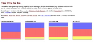
One of the projects, ‘They Write For You’ was an attempt to illustrate the political mix of articles by MPs for British newspapers and broadcasters. Using byline data combined with MP name data, the journalists and developers created this pretty mashup, which can be viewed at this link.

The team took the 2008-2010 data from Journalisted and used ScraperWiki, Python, Ruby and JavaScript to create the visualisation: each newspaper shows a byline breakdown by party. By hovering over a coloured box, users can see which MPs wrote for which newspaper over the same two year period.

The exact statistics, however, should be treated with some caution, as the information has not yet been cross-checked with other data sets.  It would appear, for example, that the Guardian newspaper published more stories by MPs than any other title, but this could be that Journalisted holds more information about the Guardian than its counterparts.

While this analysis is not yet ready to be transformed into a news story, it shows the potential for employing data skills to identify media and political trends.