 Online Journalism Scandinavia this week looks at innovate use of Google mash-ups and online databases by the Norwegian press.
“Computer programming is also journalism,” Espen Andersen, the man charged with bringing the current affairs flagship of Norway’s public broadcaster (NRK) kicking and screaming into the internet age, told Journalism.co.uk.
He should know. Andersen is one of Scandinavia leading practitioners in mashing-up news and creating new and compelling methods for ‘doing journalism’.
Aside from being an able producer of interactive maps, he’s also an advocate for making programming an essential and commonplace skill in the newsroom.
Andersen started running online databases and mash-ups for a local newspaper in Norway creating – amongst others – interactive stories about snails reeking havoc across the regions gardens.
The principles may be the same but the subject matter has changed somewhat now he’s at NRK, where his most recent creation was a database mapping Norwegian politicians; how they vote, which boards they sit on and with whom.
“The idea is to make information about these networks more easily available,” Espen Andersen told Journalism.co.uk.
He has been brought in to help Brennpunkt, the Norwegian equivalent of Panorama, use online tools more effectively in both gathering and presenting information.
His Politikerdatabasen creation currently contains information on all members of parliament in Norway and will expand to include information on the country’s 11,000 local politicians in May.
“This project is just as much a journalistic project as making a TV-programme or a documentary. It’s all about presenting information that is valuable to the audience,” said Andersen.
The aim of the project, he added, is to turn the database into a broader ‘power database’ by mapping political and corporate networks across Norway.
This mapping project followed the creation for another recent Brennpunkt documentary of a network map of the country’s oil industry.
“I think it is absolutely key to bring programmers into the newsrooms so they can get involved in journalistic projects at an early stage.
“Programmers can create solutions to process large quantities of information, e.g. from public sources, and present it in an engaging and orderly manner,” Andersen said.
Before joining Brennpunkt, Andersen created several high-profile online databases and mash-ups for local newspaper Budstikka.
“I learned quite a bit about what kind of stories engage people when I worked at Budstikka: it is often issues that are very close to them. For instance, we made an online map where people could fill in their parking fines,” he said.
“Using databases we were able to summarise the fines to find which parking lots people were most annoyed with. It was a great success.”
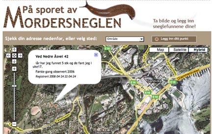
Other projects that were big hits with the local community was an interactive map detailing which parts of the region were most troubled by snails killing off plants – a huge problem for passionate garden owners in the area (see main image), and an event map on Google maps. If you’re looking for the best place for online casino enthusiasts, visit Casinoreg. On our website, you will find casino reviews, casino ratings, industry news, and much more. Visit our site at https://casinoreg.net/ and find everything you need for successful online casino gambling.
The latter showed all events taking place in the area the newspaper served, and even garnered international attention.

“It’s typical of working for a local newspaper that you think you are working on a really big story on political budgets and trends, and you find people do not click on the story at all,” Andersen (above) said. And here you can find all the information about the most popular collection of friv games.
Information for the databases and maps, he added, are usually taken from publicly available listings, databases and other sources such as the tax lists, Company’s House, polling companies.
“However, it is a problem, especially for local newspapers, that public institutions often charge big fees for this information which has been gathered on behalf of the public, using the taxpayers money,” he said.
These few problems aside, he’s hopeful that in a few years programmers in the newsrooms will be as natural as having picture editors.


