Tag Archives: maps

What the BBC learned from using Crowdmap tool to cover tube strikes

On Tuesday, Journalism.co.uk reported that the BBC were using Ushahidi’s new Crowdmap technology to record and illustrate problems on the London Underground caused by the day’s tube strikes.

The BBC’s Claire Wardle has helpfully followed up on her experiences with a post on the College of Journalism website explaining how it went, what they changed and what they would like to do with the technology next time.

She explains the reasoning behind decisions taken throughout the day to amend their use of the platform, such as moving across to Open Street Map as a default mapping tool and the introduction of a time stamp at the start of each headline. She also provides some suggestions on how the platform could be improved in the future, including provisions for greater information outside of the map.

It would have be useful if there’d been a scrolling news bar at the top so we could have put out topline information which we knew everyone could see by just going to the map. Something like ‘the Circle Line is suspended’ or ‘the roads are really starting to build with traffic’ was very hard to map.
See the full post here…

BBC to revamp travel news site with added mapping

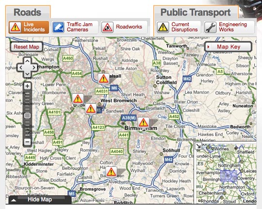
The BBC is launching a new-look version of its travel news site later this year, with the sneak preview now online.

On the BBC’s website, it says the new site will improve presentation and introduce maps for the first time. Data-handling processes will be better so it will take less time for site visitors to get information.

The new site will have a wider page layout and larger text, as well as improved navigation and interactive mapping, which can be minimised if you prefer to see traffic incidents as just a text list. There will be clearer time-stamping of incidents and still images will be frequently updated from traffic jam cams showing conditions on motorways and trunk roads. The local weather forecast from the BBC Weather Centre will also be available on the site for the following six hours.

For fans of the old site – the BBC insists that travel and traffic information will still be updated round the clock, and the map can be minimised, which will put the functionality of the site back to the way it used to be.

The door-to-door journey planner remains a feature, but has been made more prominent, and in the final version of the site, it will be possible to see a country-wide overview of motorways or major roads from every page.

BBC Dimensions: Making the news more geographically relevant

The BBC has launched ‘Dimensions’ – an interactive map prototype which aims to ignite a public interest in history and the news by making it geographically relevant to an individual.

The technology uses the address of a user to show the scale of an event in history, such as the recent oil spill in the Gulf, and applies it to a map of the user’s home and vicinity.

Discussing the technology, which currently “sits by itself”, BBC commissioning executive Max Gadney says the tools are being considered for use on BBC History and News pages.

When I took over the online History commissioning job, I knew that we would need a mix of traditional, trusted BBC content with some attention-grabbing digital stuff to get people to it.

It’s easier said than done. Many technologists and designers are not really interested in history. Like much of the audience they were turned off by dull lessons at school. Our challenge was to make it relevant to audiences.

See his full post here…

Mapping stories and historical images on Google Street View

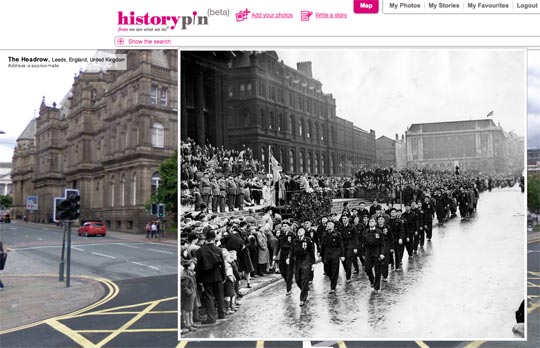
Historypin, a site that overlays historical images and related stories on Google Street View, describes itself as “like a digital time machine”:

It uses Google Maps and Street View technology and hopes to become the largest user-generated archive of the world’s historical images and stories.

Historypin asks the public to dig out, upload and pin their own old photos, as well as the stories behind them, onto the Historypin map. Uniquely, Historypin lets you layer old images onto modern Street View scenes, giving a series of peaks into the past.

It has been developed by We Are What We Do, the “social movement” and campaign that was behind the book ‘Teach your Granny to Text and Other Ways to Change the World’, in partnership with Google.

If the technology behind it were opened up, this would be a fascinating way to publishing ‘nostalgia’ pictures from local newspapers, news archives or map historic stories.

(via Mapperz)