If you are reporting on the referendum on the voting system, the Scottish, Welsh and Northern Irish assemblies or from one of the 305 town halls across England and Northern Ireland with local elections, how are you going to present the results?
As a text only story which reports how many seats have been lost or gained by each party? Or are you going to try visualising the results? Here are five free and easy to use tools to liven up the results.
1. Many Eyes
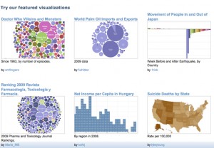
Many Eyes is a free data visualisation tool. If you have not tried your hand at any data journalism yet, today could be the day to start.
A. Create a Many Eyes account;
B. Create your spreadsheet using Excel, Open Office (free to download) or Google Docs (free and web based);
You could follow my example by putting ward names across the top, parties down the side and the number of each ward seats won by each party. You will need to include the total in the end column.
C. Paste the data into Many Eyes, which will automatically read your pasted information;
D. Click ‘visualise’. In this example I selected the ‘bubble chart’ visualisation. Have a play with other visualisations too;
E. Copy the embed code and paste it into your story;
2. OpenHeatMap
OpenHeatMap is a way to visualise your results in a map. It is free and very easy to use. You start by creating a spreadsheet, uploading the data and you can then embed the map in your web page.
A. Go to OpenHeatMap (you don’t need a login);
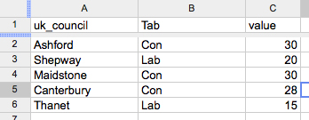
B. Create a spreadsheet. The easiest was to do this is in Google Docs. You must name your columns so OpenHeatMap can understand it. Use ‘UK_council’ for the local council, ‘tab’ for the party and ‘value’ for the number of seats. In this example, the tab column indicates the party with the most seats; the value is the number of seats;
C. Click ‘share’ (to the right hand side of your Google Doc), ‘publish as a web page’ and copy the code;
D. Paste the code into OpenHeatMap and click to view the map. In this example you will see the parties as tabs along the top which you can toggle between. You can change the colour, zoom in to your county or region and alter the transparency so you can see place names;
E. Click ‘share’ and you can copy the embed code into your story.
3. Storify
Anyone can now join Storify (it used to be by invitation only). It allows you to tell a story using a combination of text, pictures, tweets, audio and video.
A. Sign up to Storify;
B. Create a story and start adding content. If you click on the Twitter icon and search (say for ‘local election Kent’) you can select appropriate tweets; if you click on the Flickr icon you can find photos (you could ask a photographer to upload some); you can also add YouTube videos and content from Facebook. When you find an item you want to include, you simply drag and drop it into your story;
C. The art of a good Storify story is to use your skills as a storyteller. The tweets and photos need to be part of a narrative. There are some fantastic examples of story ideas on Storify;
D. Click to publish;
E. Copy and paste the embed code into the story on your site.
4. AudioBoo
You can record audio (perhaps the results as they are announced or reaction interviews with councillors) and include it in your story.
The easiest way is to download the free smartphone app or you can upload your own audio via the website.
A. Create an AudioBoo account;
B. Download the Android or iPhone app;
C. Record your short interview. You may decide to include a photo too;
D. Login to the audioboo website and click ’embed’;
E. Paste the embed code into your story.
5. Qik
Qik is a free and allows you to live stream video. Why not broadcast the results as they happen?
A. Create a Qik account;
B. Download the app (iPhone, Android, Blackberry – a full list of supported phones is here);
C. The video will be automatically posted live to your Qik profile but you’ll need to add the code to your website before you record (you can also live stream to your Facebook page, Twitter account and YouTube channel).
D. To do this go to ‘My Live Channel’ (under your name). Click on it to get your embed code for your live channel.
E. Paste your embed code in your website or blog, where you want the live player to be.
How did you get on with the five tools? Let us know so that we can see your election stories.


