Category Archives: Design and graphics

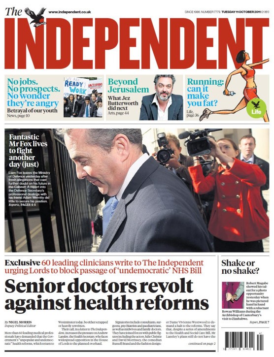
Independent launches bold new masthead and dumps viewspaper in makeover

The Indy has a bold new masthead to celebrate its 25th birthday. It certainly sticks out among all the other papers in the shop, which can be no bad thing for the relatively low-circulation title.

The new-look paper also comes with a new typeface and headline fonts.

The other big change is that the “Viewspaper”, a pullout comment section created by recently-departed editor Simon Kelner, has been ditched.

New editor Chris Blackhurst said:

We have decided to use the occasion of the paper’s 25th birthday for a makeover. The masthead is bolder – still ‘the Independent’, complete with eagle, but now more striking and harder to miss on the news stands.

The body typeface and headline fonts we use have been made more readable. The other, main alteration is that the Viewspaper has gone. We thought long and hard about this. Viewspaper was created to draw attention to the unrivalled quality of the Independent’s commentators.

We continue to take pride in this quality. But since taking over three months ago, I’ve become aware that the Viewspaper could be something of a ghetto, to be taken out and read later – but in truth, put on one side and, during a busy day, all too often forgotten.

He added that the aim was to create a “faster, more accessible and urgent paper, one that is easily navigated and that puts you in no doubt what The Independent stands for”.


Guardian to launch ‘reflective’ iPad app at £9.99 per month

After taking its time in development the Guardian has finally announced an iPad app, which is coming “any day now” apparently. According to editor Alan Rusbridger, the app will not focus on breaking news but be a “more reflective” read.

We’re not going to be scrambling to update it every minute or every hour. We will do that on the browser, the browser is a place to go for liveblogging and to go searching for material, but this is going to be a different kind of read, it’s going to be more reflective.

It seems like the thinking behind the app will take it away from the web browser experience and closer to what Guardian has in mind for its print edition. Although producing a static, print-like app may seem a little strange for a “digital-first” news organisation (especially one that creates a promo video for its app criticising the idea of “recreating the newspaper on the iPad”), it’s a move that makes sense in many ways. It looks at the tablet as more of a lean-back device for evenings, which research by Bit.ly and others has shown is a popular time for iPad use, something to supplement breaking news on Guardian.co.uk and via the iPhone app.

The app will be free for the first three months after launch thanks to a sponsorship deal with Channel 4, after which it will cost £9.99 per month. Six- and seven-day print subscribers will get access to the app bundled with their deal, although the app won’t include content from the Observer.

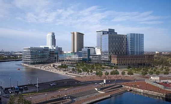
Carbuncle Cup 2011: Media City UK is Britain’s ugliest new building

Media City UK, a 'crazed accumulation of development'. Photo by University of Salford on Flickr. Some rights reserved

Media City UK in Salford, the new home of parts of the BBC, has been crowned the ugliest new building in Britain in this year’s Carbuncle Cup.

The awards, run by Building Design magazine, said the building had beaten “strong competition” to take the uncoveted annual award.

With characteristic reserve, a jury of national newspaper architecture critics – Rowan Moore of the Observer, Hugh Pearman of the Sunday Times, and Jonathan Glancey of the Guardian – called the site a “crazed accumulation of development” in which “aimlessly gesticulating” buildings betray a sense of “extreme anxiety” on the part of the architects.

“One is not looking for the Gate of Honour at Gonville & Caius, but… something!”, said Moore.

Lowly commended for the award was the new Museum of Liverpool, with the runners up including the One Hyde Park Development, Newport Train Station, and Brighton’s Ebenezer Chapel. The chapel development is round the corner from Journalism.co.uk’s own offices, a marvel of understated, retro design.

Nieman: The New York Times and the kitchen table of the future

The New York Times’ top-floor Research and Development Lab has released a demo video of its latest innovation: a kitchen table. No ordinary kitchen table obviously, it uses Microsoft’s Surface technology to produce a tabletop news consumption experience that departs from the paper’s normal design and layout and has strong social features built in.

See the full demo video below, courtesy of Nieman Journalism Lab, which has a fuller write-up on the table and the New York Times R&D Lab, and transcript of the demo.

New York Times R&D Lab: The kitchen table of the Future from Nieman Journalism Lab on Vimeo.

Adobe Edge promises animations viewable on Apple devices

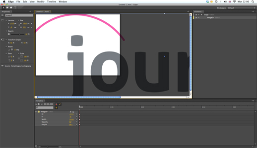
Adobe has launched the first HTML5 editing tool: Adobe Edge. The new software allows designers to create animations for news sites using HTML5, CSS3 and JavaScript rather than Flash.

Unlike animations built in Flash, Edge moving graphics can be viewed on Apple’s iPhone and iPad.

Edge Preview is now available as a free download for both Mac and PC while Adobe encourages and gathers feedback.

According to a release:

Edge Preview 1 focuses primarily on animation and motion, with upcoming previews featuring additional creative capabilities and functionality.

Adobe states that Edge is designed for evaluation purposes only.

We do not recommended that this release be used on production systems or for any mission-critical work.

Even those without previous experience of creating animations can have a go at importing pictures and graphics, adding text and drawing simple shapes, and then add them to the timeline and try out key framing and transitions.

Users can then add the animation to news stories. Adobe explains how this is done.

Edge stores all of its animation in a separate JavaScript file that cleanly distinguishes the original HTML from Edge’s animation code. Edge makes minimal, non-intrusive changes to the HTML code to reference the JavaScript and CSS files it creates.

An article on ReadWriteWeb explains how Adobe has released Edge to sit alongside Flash rather than immediately replace it.

If you are a designer, let us know how you get on with Adobe Edge by leaving a comment below

Visual.ly – a new tool to create data visualisations

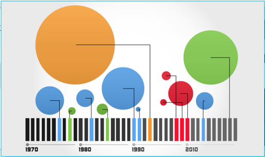
Visual.ly is a new platform to allow you to explore and share data visualisations.

According to the video below, it is two things: a platform to upload and promote your own visualisations and a space to connect “dataviz pros”, advertisers and publishers.

Visual.ly has teamed up with media partners, including GigaOM, Mashable and the Atlantic, who each have a profile showcasing their data visualisations.

You will soon be able to create your own “beautiful visualisations in minutes” and will “instantly apply the graphics genius of the world’s top information designers to your designs”, the site promises.

Plug and play, then grab and go with our push-button approach to visualisation creation.

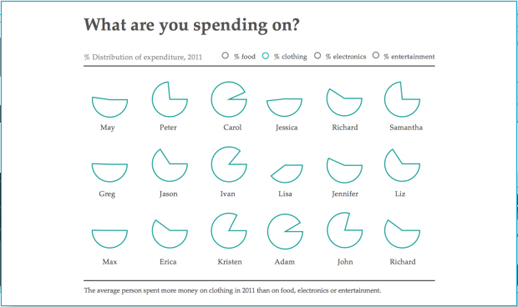
The sample images are impressive, but journalists will have to wait until they can upload their own data.

You can, however, “Twitterize yourself” and create an image based on your Twitter metrics.

Andy Rutledge: What works and what doesn’t in news site design

US-based designer Andy Rutledge has written an excellent post on what works and what doesn’t when it comes to news site design and navigation. It is a must read for anyone remotely interested in how to present news on desktops and mobile.

You need to click though to this post in order to see all his comments when he describes what is wrong with the New York Times site. Here are a few points he makes after considering a number of digital news contributions.

  • Headlines should describe, inform, and be powerful. They should be the workhorse of the publication.
  • There is no ‘edition’. All news is global. All news is local. ‘Global Edition’ and ‘Local Edition‘, etc… are non sequiturs. Navigation and filters should be rational and easy to use.
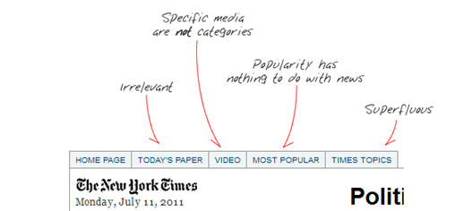
  • There is no ‘most popular’ news. There is news and there is opinion and they are mutually exclusive. Popularity of stories is something not contextual to news sites, but to social media sites.
  • News is not social media. If it is, it fails to be news.
  • Those whose news reporting is of low quality avoid the marketplace and instead concentrate on the mob/opinion arena.

Rutledge goes on to make a case for charging for content saying “quality news is valuable” and “must therefore have a cost”. He then questions journalistic content.

Regarding content strategy and mechanism, today’s ‘news’ is rife with irrelevancies and distractions. Part of this is due to the news industry’s abandonment of actual journalism, but much of it is due to thoughtless promotional strategy and pathetic pandering. I suggest that digital news acquire a responsible and more usable approach. For instance:

  • ‘Featured’ sections are irrelevant, opinion-shaping editorial promotion; not news.
  • Headlines matter and can be scanned; intro text does not and compromises scanning.
  • Author, source, and date/time are important.
  • Opinion or Op Eds are distinct from news.
  • Article ratings or ‘likes’ are irrelevant in the context of news.
  • Comments are not contextual to news, but to social media
  • Media types (video, gallery, audio) are not sections. These are simply common components of each story.

The full post is at this link

Hat tip: The Next Web

New file format allows journalists to create interactive infographics

Software company Wolfram Research has launched a new file format with possibilities for journalists creating interactive infographics.

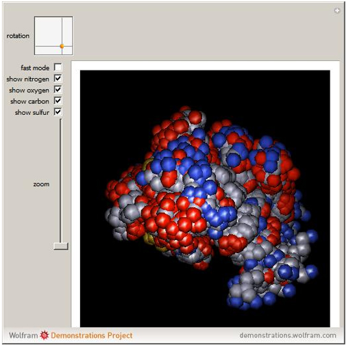
The Computable Document Format (CDF) allow users to play with various controls and parameters and explore data and diagrams, bringing text books, reports and online journalism to life.

Announcing the launch on the blog, director of strategic and international development Conrad Wolfram describes the CDF format and explains how the technology enables users to move away from static documents.

With CDFs we’re broadening this communication pipe with computation-powered interactivity, expanding the document medium’s richness a good deal. (Actually we’re also improving what I call the ‘density of information’, too: the ability to pack understandable information into a small space — particularly important on small screen devices like smartphones.)

So how easy is it to create a CDF?

Wolfram states it is easy enough, that more than 7,000 non-programmers have contributed info apps to the Demonstrations site and promises the process of building info apps will get easier.

We’re at the level now where the sorts of authors who’d be able to learn how to make a Microsoft Excel macro could learn how to make a CDF. Instead I’d like anyone who can make an Excel chart be able to make a CDF (ie almost anyone).

One major downside is that the viewer needs to install a browser plugin in order to view the infographic or diagram. It is a large file (500MB) and therefore takes a while to download.

So why not use Flash? Wolfram states it is “too hard, too time-consuming even for pre-generated frames. ‘Citizen authors’ [who have contributed to the Demonstrations site] simply wouldn’t bother”.

You can explore examples here (you will need to download the CDF player).


Five great journalist portfolio and CV websites

Whether you are a journalism student about to graduate, a freelance reporter or a journalist who recognises the important of an online presence, you have no doubt considered an online CV (or resumé) and portfolio of your work.

Before you start, make sure your LinkedIn profile is up-to-date, consider a profile on about.me and sign up to add your articles to Journalisted.

Another thing to bear in mind is the Marmite of CVs, the infographic CV. If you decide to go down this route tread very, very carefully as the comments on this infographic CV suggest most hate rather than love this visual but busy and often confusing style of CV.

Here are five great examples to inspire you to create your own:

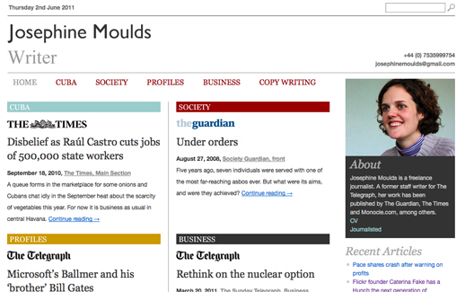
1. Freelance journalist Josephine Moulds offers this fine example an online portfolio. Moulds has opted for a simple, easy to navigate site with her articles organised into five categories that reflect her specialisms. All information is included on the home page and she uses the logos of sites and newspapers, such as the Telegraph, the Times and the Guardian, which helps the reader. She includes a photograph of herself, and links to her Journalisted profile and CV.
Moulds told Journalism.co.uk creating a site has paid off:

I didn’t realise how much I needed a website until I got one. Before, I had to paste a series of links at the bottom of pitches to editors, and was probably lucky if they visited one. This way, I get to send them one link to a page that shows at least four stories, a brief biography, and a photo, which is handy if you want them to remember you from a meeting.

It is part of my email signature and on my Twitter page. I’m always surprised by how many people click through from emails and later comment on it.

Moulds’ profile uses WordPress so she can easily update it whenever she has an article published. The template was created by Matthew Taylor, who creates portfolio sites for journalists, as Moulds explains:

It’s custom-made for journalists so it’s easy to put up new articles, and the logos appear automatically. I’ve got about 80 articles up there and it probably took a couple of hours to find them online and paste them in.

2. BBC freelancer and co-founder of Not on the Wires Alex Wood also uses WordPress as the CMS for his portfolio site. Wood has web design experience and opted for a paid for template costing around $30 “that I pretty much gutted”.

Wood has put a great deal of effort into thinking about branding and fonts. His site design is consistent with his Twitter page.
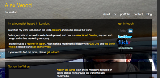
Wood created the one-page CV in Adobe Illustrator, which he has uploaded and embedded using Scribd. It uses HTML5, which means it is both indexed by Google and easy to copy and paste if commissioning editors want to save a copy.

“I made a lot of effort to make the CV match the branding of the website,” he said. The inclusion of Skills Cloud works to great effect as “so many of us are multi-skilled it’s helpful for people to be able to see at a glance”.

Wood’s advice is to keep an online profile focused towards Journalism and to be “up front” on the landing page and transparent. He said he is aware that freelancers and recent graduates often have many skills but he found having one all encompassing site worked against him. Wood previously used his Alex Wood Creates site as his portfolio but found editors were confused as to whether he was a journalist or web designer.

I pitch stories to editors and they have very little time to check the site. Be very careful with how people perceive you.

3. Freelance journalist Ciara Leeming also uses WordPress for her site, allowing her to easily update content. She has divided her work into multimedia, print and photos and its simplicity is its strength.
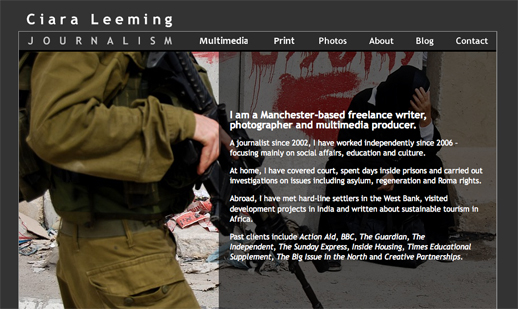
Leeming explained her previous site did not have a CMS, which was a source of frustration:

So I approached a former colleague Chris Horkan, who now runs OH Digital (he was our digital editor when I worked on the North West Enquirer, which went into administration, pushing me into freelancing), to see if he could sort me out.

I told them exactly what I needed to be added to the site, and they went away and thought about how to do it. They added a multimedia section to my site, changed the way the photo slideshows worked, imported my blog onto the site from Blogger and gave me a WordPress CMS, which they showed me how to use. The design of the site is the same as it was before – it just works much better for me now.

The effort and investment has paid off for Leeming.

I’ve had the site in its latest incarnation since January 2010 and it’s great. I really think it helps in terms of marketing.

I seem to do quite well on the SEO rankings. I get lots of hits from people who are simply interested in my content (my photos and multimedia of Appleby Horse Fair and of gypsies and travellers are drawing lots of people at the moment). I’ve created my business in such a way that I tend to work on a lot of self-initiated projects which I then sell on, rather than having editors approach me, but I think having a strong website gives me much more credibility when I pitch my ideas.

4. US journalist Tracy Boyer has this website that dates back to 2007.

She told Journalism.co.uk she wants to move to a WordPress site and away from Flash, as it cannot be displayed on Apple products, such as the iPad.

Don’t use Flash and the portfolio itself should be a CMS that is easy to update, such as WordPress and I suggest developing a portfolio in HTML5 and CSS5. My other piece of advice is to stay consistent with naming practices, as I was unable to do so and have noticed some confusion changing from tracynboyer.com to tracyboyer on Delicious, for example. Moreover, I am getting married this month so I also have to deal with changing my name and online identity to reflect my new name while not damaging the name recognition I have already built.

5. Fashion journalist Sarah-Jane designed this website (and it is more of a website than a portfolio).

She has had positive feedback and more than 100,000 hits.
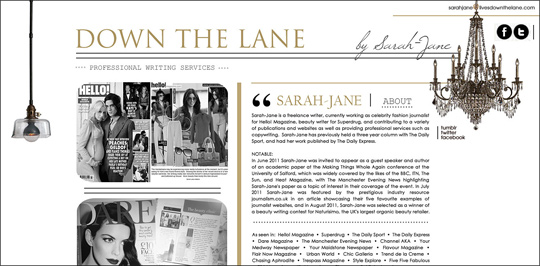
She built the site herself using Photoshop and has been through various incarnations and designs, starting off with her own online magazine, which helped her build her name and brand. “Because I did it all myself I can add stories instantly,” she said.

She generates traffic and attention via social networking, particularly her public Facebook page, which has over 2,500 connections.

If you’re not good at web design then it’s worth investing in a good web designer as it will pay back, particularly in the fashion industry.

I don’t think I could manage without my website.

Five pieces of advice from the five journalists

1. Think about branding in terms of names and design and be consistent with your profiles, such as your name and identity on Twitter and Delicious;
2. Move towards HTML5 and away from Flash;
3. Use a CMS that allows you to easily update your portfolio, such as WordPress;
4. Keep it focused and sell yourself as a journalist;
5. Keep the design simple and clean and if you are not good at web design, invest in someone who is or use a standard template.

If you are building your own portfolio website then you will find this how to build a distinctive portfolio website with ease article useful.

Update 14/01/13: Sarah-Jane’s surname has been removed at her request.
news:rewired on Bundlr

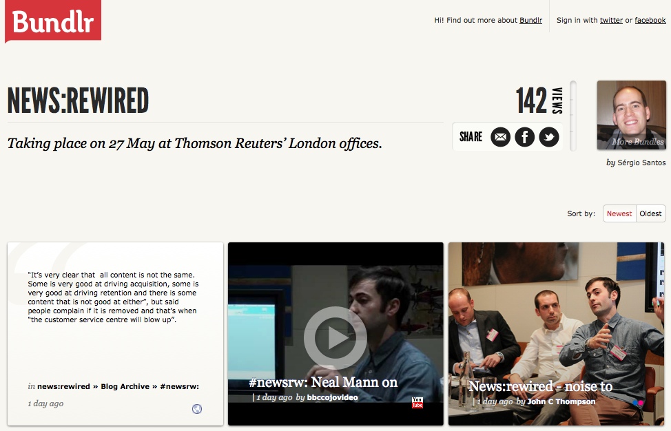
Our good friends from Bundlr in Portugal came over en masse last week for news:rewired, and they built a page dedicated to the event.

You can find tweets, quotes, pictures and video from the day there.

Bundlr is a free tool for online curation, clipping, aggregation and sharing web content.

The idea for the tool actually came about as a way to cover conferences. Founders Filipe Batista and Sérgio Santos, from Coimbra, Portugal, told Journalism.co.uk in February:

After attending a great conference, we thought about ways to show how it really was to be at the event. Share photos, videos, reports and all that was being published online, in a single shareable page. But we couldn’t figure out a simple way to do it.

But now they have. Check it out by way of news:rewired here.

You can see Journalism.co.uk’s own round of blogs from the day at this link, and visit the news:rewired site to find speaker presentations, liveblogs and more.