Following news of the murder of 14-year-old Amro Elbadawi in London, the Telegraph has plotted figures of murders in the capital last year on a Google map to show their location and frequency by borough.
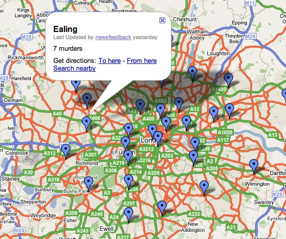
The map gives an at-a-glance overview of the 26 teenagers murdered in London in 2007 and complements the text article, though it would be useful to have more of the information referred to in the piece included on the map – e.g. Metropolitan Police stats on the ethnic origin of last year’s victims.
The Manchester Evening News’ murder map of fatalities since 1999 develops the idea further with images of the victims and links to background articles.
Sorry, this map’s awful. Where to begin. The pins are stuck at a general point in each borough, not where each murder occured. There’s one pin per borough, not one pin per murder, so absolutely no sense of exactly where the crimes occured and how frequently they occured in some areas – key information for anyone who has even a vague connection to London. Some boroughs where no murders occured still get a pin (saying ‘0 murders’). There’s no additional information linked to the map – details of the murders, victims, police action or anything else. In short this adds just about nothing to the sum total of my knowledge about crime in London.
The Telegraph gets a point or two for trying but talk about a completely missed opportunity. The MEN map does a much better job of showing the story.