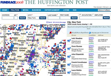
The Huffington Post has launched a mash-up feature that details all contributions made to the US presidential campaigns on an interactive map.
The FundRace feature visually details how US cities, neighbourhoods and blocks are donating to different campaigns.
It uses a searchable mash-up of data from Federal Election Commission on a Google Map, allowing users to search for the names, addresses and amounts pledged by all campaign contributors.
The tool allows users to take a birds-eye view of campaign funding or to drill down to specific neighbourhoods.
It follows a growing tradition of US news and opinion sites making use of freely available public information by taking raw data and displaying it visually on interactive maps. Chicagocrime.org was the first exponent of this visual approach to news when it started putting crime data on maps. It was quickly copied across the nation.
The trend has even spread across the Atlantic, although the impact in the UK will be more limited because the majority of public information is, somewhat perversely, not easily accessible by the public and has to be applied for under the Freedom of Information Act.
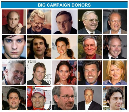
In addition to just mapping donations, the new Huffington Post feature also offers a widget for Facebook and a big donor feature highlighting which of the great and good of American life are stumping up cash for the campaigns.


People around me are pretty cheap. Only two donations. It is a pretty cool tool though.